I wanted to start looking at legit data sets that exist in the wild, so I went to data.gov and downloaded the state drug utilization data from 2010. I am going to test it out with Pandas and see what I learn. Here is their description of what the data represents:
Drug utilization data are reported by states for covered outpatient drugs that are paid for by state Medicaid agencies since the start of the Medicaid Drug Rebate Program. The data includes state, drug name, National Drug Code, number of prescriptions and dollars reimbursed
This was a pretty big data set at almost 400 MB. The spreadsheet that I am using, Numbers wasn’t up to the job. I am on a mac and that is obviously what I have to work with. To get cracking I need to load the file into Pandas to create a data frame:
import pandas as pd

filename= 'State_Drug_Utilization_Data_2010.csv'
drug_df = pd.read_csv(filename)
Crap, from the start there are already problems loading the data: sys:1: DtypeWarning: Columns (19) have mixed types.Specify dtype option on import or set low_memory=False. With a little bit of Google magic I came across this article which explains that this error really means that Pandas couldn’t read the data because there was a field that it couldn’t determine the type for. The solution was simple, I just needed to manually tell it to load the column as an object:
drug_df = pd.read_csv(filename, dtype={"NDC" : object})
Now when we print the head to get the top 5 rows we get the data that we are looking for:
Utilization Type State … Location NDC
0 FFSU WI … (37.768, -78.2057) 17478021420
1 FFSU NH … (47.5362, -99.793) 409116502
2 FFSU XX … NaN 338062904
3 FFSU TN … (41.6772, -71.5101) 68382009906
4 FFSU WY … (44.0407, -72.7093) 472091145
I want to take a look at the count of the unique drugs that exist in the set and I want to get that same metric grouped by state. As I am learning Pandas I find that basic tasks are pretty simple. I am not sure if that is a factor of the library or the simple nature of Python.
print(drug_df['NDC'].nunique())
by_state = drug_df.groupby('State')['NDC'].nunique()
print(by_state.describe())
Above I have taken the data frame and first captured the count of unique drugs that were prescribed and then I did the same query but had the results grouped by their state. The output of that is pretty long, but the interesting pieces are the unique count is 21977 medicines prescribed and the output of the count grouped by state:
Name: NDC, dtype: int64
count 52.000000
mean 1211.346154
std 613.963877
min 421.000000
25% 842.000000
50% 1077.500000
75% 1362.000000
max 3826.000000
I can’t speak to why it shows that there are 52 states, but I do see that it add a state XX, which I assume is the bucket for NA. I decided to hone in on something familiar. The SSRI Sertraline is a very common anti-anxiety medicine that also has applications across a large spectrum of mental health disorders. So I wanted to ask the question of what is the prescription rate by state and is there any interesting in the data. To get started I took the data frame and filtered it down to only rows that have the drug sertraline. First I had to remove the null rows. The data set has the value presented as upper case and lower case, so I lowered the case and did the comparison that way:
drug_df = drug_df.dropna() # remove the nulls
df = drug_df[drug_df['Product Name'].str.lower() == 'sertraline'] #do the filtering
Now that I have reduced the data set to only contain the drug I am interested in I can start to perform some aggregation. Like mentioned above, I wanted to see the amount of Sertraline that is prescribed in the states so I need to group by State and then sum up the prescription quantities. If we simply print the count by state we get something similar to this:
       Number of Prescriptions State
420                      125.0    AL
1060                      82.0    MS
1305                      51.0    WI
1580                    1162.0    SC
2128                      49.0    GA
Now we can do the grouping and the accumulation and graph it. For the charting I am using matplotlib. I tried several different types of charts, but since the data is so simple a bar chart seems to be the most appropriate. Here is what we need to do now to present the chart:
df = df.groupby('State')['Number of Prescriptions'].sum()
df = df.nlargest(10)
df.plot(kind='bar',x='State',y='Number of Prescriptions',color='red')
plt.show()
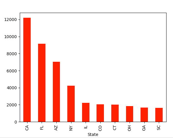
So what is the take away from this exercise and the results. The simple answer is I don’t know. It looks like California heavily prescribed the drug Sertraline for Medicare patients in 2010. You cannot make any inferences past that since there were few other fields in the data. I would be interested in seeing a comparison with the same data set from last year, so I will keep searching if that data is available. Anyways…
In this post I learned how to do a few things:
- Tell Panda what is the column type when you get that weird error: sys:1: DtypeWarning: Columns (19) have mixed types.Specify dtype option on import or set low_memory=False
- You can take a single column and filter the rows using a standard comparison: df = drug_df[drug_df[‘Product Name’].str.lower() == ‘sertraline’]
- The groupby function is the same as the one in T-SQL, but maybe a little simpler
- You can use the plotting tool matplotlib to chart the data: df.plot(kind=’bar’,x=’State’,y=’Number of Prescriptions’,color=’red’)
I am sure that a pro would say that this is child’s play and some day I am certain I will be able to say the same, but for now I am learning so suck it.
Last thing, mental health is a serious issue in the world and if we work to lift the stigma associated with it a lot of good people could get the help they need to live a happier more enriching life!
